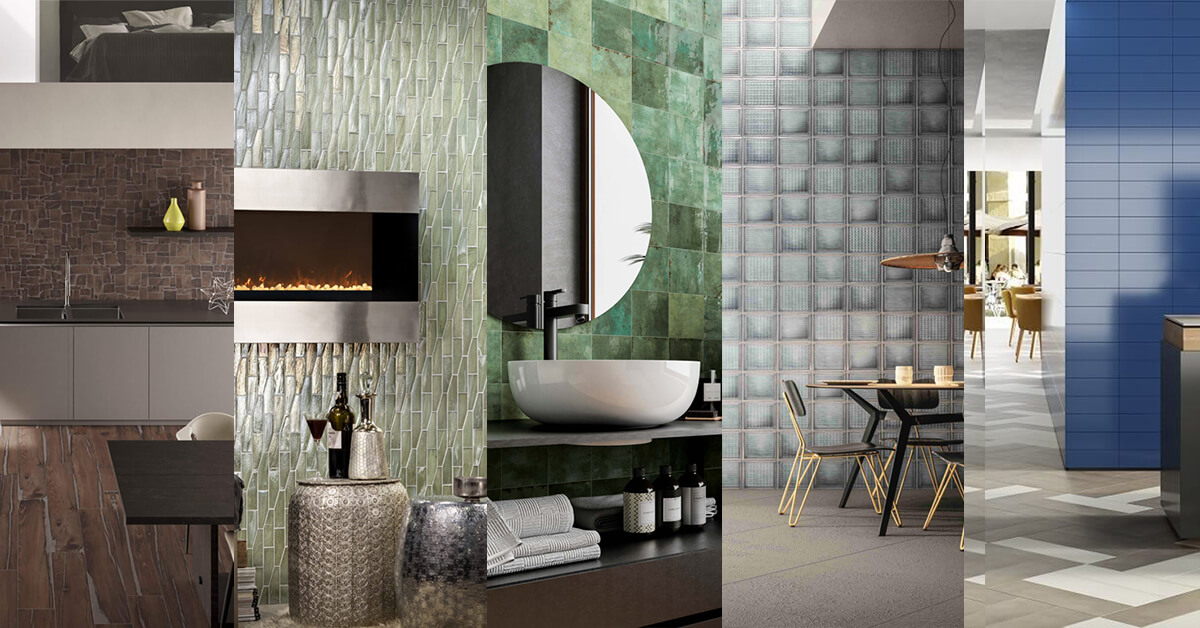
All the colors of the year 2022 from leading color experts
Each year, recognized color experts and painting companies choose a color or palette of colors that they believe best represent the current zeitgeist. Although their picks often influence interior decorating, design and fashion, it’ s based on much more than trendy aesthetic preferences, as they are based on pop culture, technology and even world events.
For instance, Pantone’s 2021 colors of the year were the ultimate gray and luminous yellow, a combination of colors that delivered the power and energy society required to overcome the ongoing unpredictability of 2021.
Pandemic continues to influence the colors of the year again this year, plus increasing preferences for biophilia and dependence on technology. However, don’t take our word for it: check out all the colors of 2022, plus examples of stunning tiles in these shades.
The 2022 Colors of the Year
Behr Color of the Year 2022: Breezeway
Behr’s 2022 color of the year is Breezeway, a sea glass green that is relaxing and invigorating. Evoking a breath of fresh air, Breezeway helps create a feeling of forward motion to aid in our spiritual resurgence this year.
Match Breezeway tiles with gray, white and natural wood tones for a seamless and harmonious look in any rooms of the home.
Benjamin Moore Color of the Year 2022: October Mist 1495
October Mist 1495 is the color of the year 2022 for Benjamin Moore. This soft sage hue is evocative of the silvery green stems of flowers, giving you a neutral color to accent your space, whilst also providing a canvas for complementary colors.
In case you’re curious about what colors to use with October Mist, then you’ re in luck. This is only one of 14 harmonious colors in Benjamin Moore’s 2022 color palette, which all embody the down-to-earth yet moody spirit of October Mist. Pick multiple tiles in any of these colors, or a tile design with all of them, for endless styling variations.
Better Homes & Gardens Color of the Year 2022: Laurel Leaf
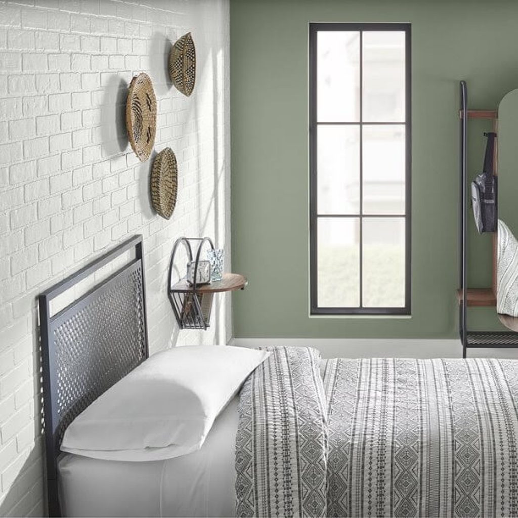
Perhaps if you’re surprised that Better Homes & Gardens has a color of the year, then you’ re not the only one. Here’s the first year they’ve chosen a color, yet they didn’t fail to deliver.
Laurel Leaf is a powdery green color that embodies eucalyptus in both looks and soul. Bringing a sense of youthfulness to your space, it blends well with light and medium wood tones, welcoming beiges and creamy whites.
Dunn-Edwards Color of the Year 2022: Art and Craft
Dunn-Edwards’ 2022 color of the year is a rather warm, earthy yet sophisticated brown called Arts and Crafts. It’ s ageless but also evokes a very different century, calling to mind the classics, academia, artisans and a more rural way of life.
No matter what Art and Craft makes you think of, will imbue a feeling of quiet and steadiness in your household. Have a peek at Dunn-Edwards’ six possible color palettes as you choose what to pair with your Art and Craft tile.
Glidden Color of the Year 2022: Guacamole
Holy guacamole, we love Glidden’s 2022 color of the year.
Yup, that’s right, Glidden’s color of the year is Guacamole, a sassy, punchy green that succeeds at being relaxing. The tone has an electric, organic feel that will lend itself to a number of decor schemes, yet we think it’s uniquely suited to retro spaces ( just take a quick peek at the bathroom above).
HGTV Home by Sherwin-Williams Color of the Year 2022: Aleutian
Jumbling things up a bit, HGTV Home by Sherwin Williams chose Aleutian as its 2022 color of the year. Aleutian is a washed indigo that balances perfectly light warm and cool hues and exudes a restful, relaxing vibe.
Mix and match Aleutian tiles with any of your preferred neutrals and wood tones in any color tone.
Pantone Color of the Year 2022: Very Peri
If any 2022 color of the year stands out above the rest, it’s Pantone’s.
2022, Very Peri, a dynamic big blue with a violet-red undertone. Very Peri is a color very much of the time: bold, courageous and intriguing, it lets us embrace the unfamiliar in the future and give free rein to our creativity.
Actually, it is the first time Pantone has created a new color for its color of the year. Such innovation is emblematic of the shift and innovation that is underway around the world.
PPG Color of the Year 2022: Olive Sprig
Olive Sprig, PPG’s color of the year 2022, is a sleek gray-green that embodies endurance and recovery, precisely what we’ll need in a post-pandemic world. The color is grounded yet subtle, making you feel at ease but also helping to brighten your day with its cheerfulness.
Olive Sprig tiles work well with natural materials such as wood tones, brassy accents, architectural elements and unique curved furniture for an organic appearance.
Sherwin-Williams Color of the Year 2022: Evergreen Fog
The bottom green on our list, Evergreen Fog is Sherwin Williams’ 2022 color of the year. Contrary to the other gray-greens introduced this year, Evergreen Fog also features a touch of blue. This high-end color is soothing and versatile, a perfect choice for a striking neutral.
Evergreen Fog blends well with other nature-inspired hues, as well, including any of the supplemental palette colors provided by Sherwin Williams.
Valspar Colors of the Year 2022: Nature-Inspired Color Palette
Valspar chose a whole palette of colors, including 12 complementary shades, rather than one color of the year:
- Blanched Thyme, a cool, organic green.
- Gilded Linen, an ultra-clean neutral
- Delighted Moon, a lively yellow
- Lilac Lane, a gentle but uplifting purple pink
- Mountain River, a deep dark blue
- Orchid Ash, a rich white
- Grey Suit, a gray with red undertones
- Subtle Peach, a soft pastel peach
- Rustic Oak, a warm, rich color reminiscent of copper
- Sunset Curtains, a subtle neutral with coral tones
- Country Charm, a cozy neutral tone
- Fired Earth, a dark but warm earth tone
Each of these colors are inspired by nature, setting a feeling of calm and comfort in your own home.
2022 Color Trends to Look Out For
Each color of 2022 holds a statement about just where we have come from and where we are headed in 2022. Therefore, it is not unexpected that many 2022 colors were either similar or emitted similar sentiments.
The growing trend toward biophilia, for example, was only strengthened by the pandemic, and stay-at-home orders reinforced the need for people to be as connected to nature as possible. The result is that this year we have plenty of nature-inspired colors, such as the warm, earthy brown tones of Dunn-Edwards and Valspar and no fewer than seven light, natural greens.
Pastel colors also reigned supreme this year, including HGTV Home’s light blue and Valspar’s light pink, peach and yellow, plus all the light greens. This makes sense considering the sense of cleanliness and purity these light, airy colors give off, which was something everyone was seeking during a global pandemic.
Pastel colors too may play a therapeutic role with their calming and replenishing characteristics. Making them an ideal choice when it comes to creating a home atmosphere that encourages your emotional well-being.
Pantone’s Very Peri represents our need to take a bold step into the unknown in 2022, as well as an ever-increasing dependence on technology. Because of this dependence, we are likely to see more intense and vivid primary and secondary colors in the future, including cheerful reds, pinks, yellows and oranges.